7 Worst eCommerce Marketing Mistakes Not to Repeat in 2020-2021
Website promotion is not an easy task, and the field of eCommerce is no exception. Therefore, to help you in your marketing efforts in 2020-2021, in this post, you can find out the 7 most commonly made mistakes by eCommerce marketers that you’d surely want to avoid on your own website. For convenience, we’ve backed up each of the points with renowned brand examples to visually show you how things can be done right.
Mistake 1: Irrational Product Categorization, Hierarchy & Site Menu
Whether you’re optimizing your current eCommerce website or building a progressive web app for it, you must mind the way you categorize your products, how your website’s top menu is fitted, and how you organize the overall hierarchy of website pages. Not only is this needed for simplifying website navigation for users, but also because these three points influence your SEO and affect your eCommerce conversion rate.
Making product categories way too narrow is a business mistake that can negatively impact your website and further conversions. The thing is that it should be easy both for your potential buyers and the search crawlers to allocate every single page. Therefore, not giving these points enough attention can lead to unwanted consequences.
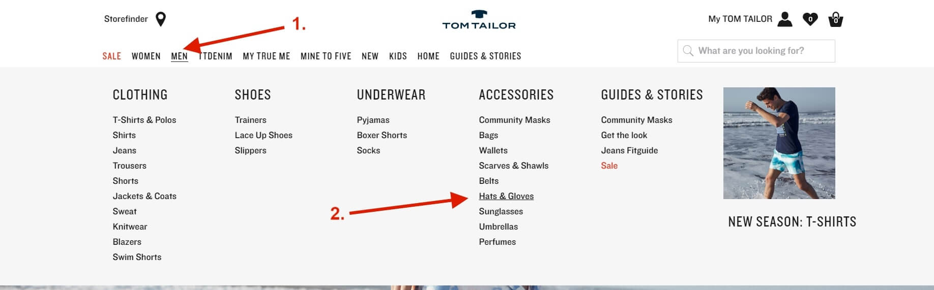
That said, in an ideal case scenario, it is recommended to place any product page no further than three to four clicks from the homepage. To demonstrate that on an example, here’s the top website menu of the official Tom Tailor website. Even though the online store boasts a broad selection of products, any item is basically available in just a few clicks.
Mistake 2: Weak Product Naming & Not Brushed-up Category Pages
Simple is always better. This ground rule should be surely followed on category pages. The greater you’ll be at managing to think through the filters and product placement in your categories sections, the likelier are your customers to follow it and narrow it down to what they’re looking for.
Preferably, make sure your images are large enough, that each product within the category has a clearly defined price, and, perhaps, show a choice of variables (such as the available colors of the item).
One more thing worth mentioning regards how your products are named. A common error that marketers shouldn’t make is not differentiating one product from another even if they are very alike. Ideally, this should be done right in the name. This is crucial for many reasons: you’ll avoid duplicate content, make the search easier, and help people distinguish one item from another.
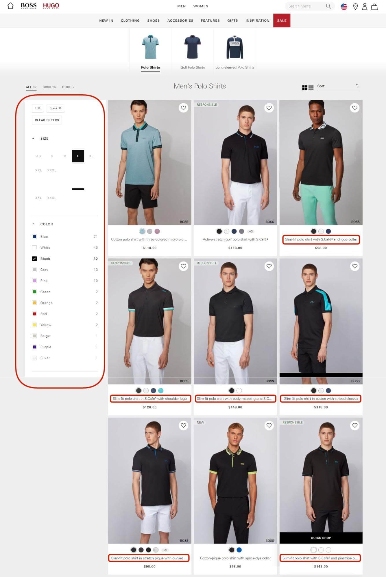
Below is the category page for Polo shirts on the official Hugo Boss website. As you can see, the filtering is very simple. More importantly, although there are more than 5 “Slim-fit polo shirts”, their naming isn’t the same, their unique points are indicated, such as “with shoulder logo” or “in cotton with striped sleeves”.
Mistake 3: Uncompressed & Unoptimized Images
An important thing that marketers should always keep an eye out for is website speed. If pages are loading slowly, this means that the store is simply underperforming and people are leaving the site without getting anything. Images are among the things that affect how quickly the website loads, therefore, they should be taken very seriously.
Yes, the pictures featured on the eCommerce store must be of great quality as they represent the product. At best, there should be an opportunity to see the details in a close-up. Each image should have an appropriate name that would precisely define the product, feature the keyword, and maybe even the brand. But more importantly, all pictures should be optimized in terms of their weight and size without quality loss.
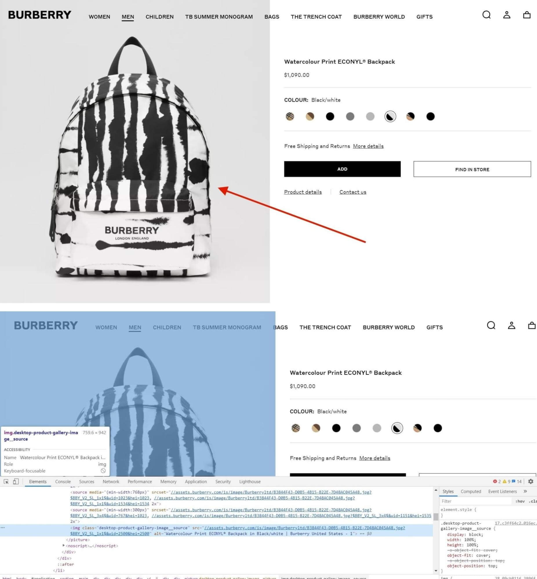
Here is a screenshot of a product page on the official Burberry website. The name of the picture only features the brand name, yet the alternative text is complete: “Watercolour Print ECONYL Backpack in Black/white | Burberry United States”. Plus, the picture is in Webp file format that allows for image compression without loss.
Mistake 4: Not SEO-Optimized Product Pages, Poor Product Descriptions & Site Texts
Products are the primary focus, period. This where potential customers spend most of their time, provided that they find the page that they need. And apart from the mentioned above correct categorization and optimal store search, there’s a step that goes beforehand, it revolves around clients managing to find your product on the web in the first place. Yes, we’re talking about search engine optimization of product pages.
At best, you should know your keywords and distribute them across the product page. This regards everything, metadata, descriptions, details, page URL. We’ve already covered proper naming of products and images and alternative texts but a second reminder that this is important and that they should be filled out won’t hurt. Also, don’t forget that the page structure should have all your headings and subheadings and that all your texts should be easy to follow, so place them on the page logically without crowding.
Bringing up the descriptions of your products, remember about:
- the personal approach (it’s advised that you address your message to one person),
- don’t copy-paste (this won’t help your users and will harm your SEO)
- be creative,
- and mention the strong sides of the item.
Similarly, do the same with other texts that appear on the page, make sure that they carry a point. This doesn’t mean that their size should be too lengthy, instead be consistent.
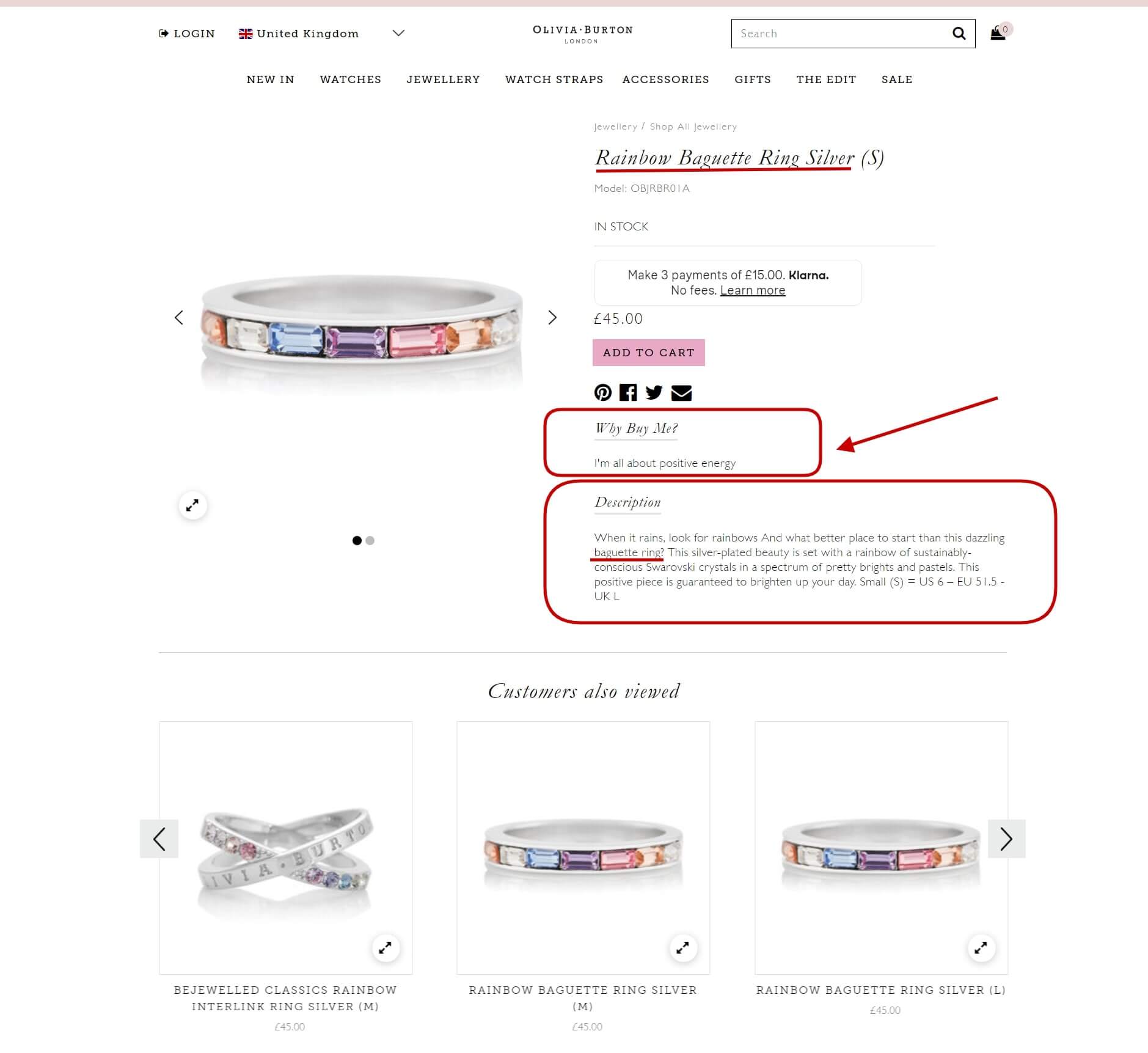
The following screenshot was taken on the official Olivia Burton website. The keyword “Rainbow Baguette Ring” is placed both in the name and description. The text is creative and inspirational “When it rains, look for rainbows”, it mentions unique points and materials “silver-plated with Swarovski crystals”, and brings up the sizes that it comes in “S”.
Mistake 5: No “Save For Later” Functionality & Wishlists
It should be quite obvious that many of the website users could just be browsing the store. They aren’t ready to buy yet. This means that sections, where people can store liked items “for later”, are more of a requirement than a suggestion.
But what does this functionality mean for marketers? For starters, marketing specialists can add such users to drip campaign mail-out lists. For example, items that were placed into wish lists can be put in discount mailers, say, offering free delivery for the product that’s in the user’s wish list.
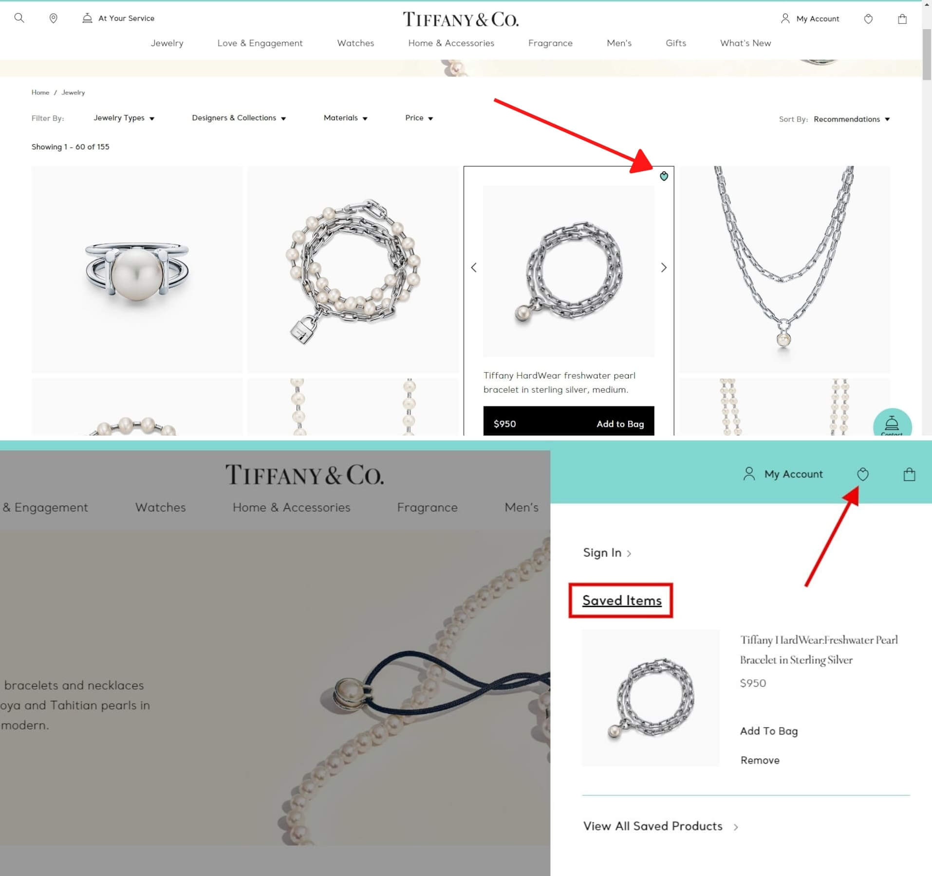
The official Tiffany & Co. website marks “Saved items” with heart symbols, such products are added to the separate wish list tab.
Mistake 6: No Client Feedback Sections
Convincing clients to make a purchase is among the tasks that marketers strive to achieve. Be it a persuasive product description, ad text, or mailer, it’s very hard to convince a person to trust you if you’re speaking from the name of the brand. Much more effective, on the other hand, are testimonials by previous clients that your “to-be” buyers surely trust more than the simple marketing promises given by you.
The points of view of real people who have something to say about the company’s services and products matter a lot. Such opinions are influential and can surely impact the purchasing decisions of others. Therefore, make sure to add such sections to the eCommerce store and to ask customers to add reviews (for instance via auto-emails or in your SMM strategy in trade for some perk).
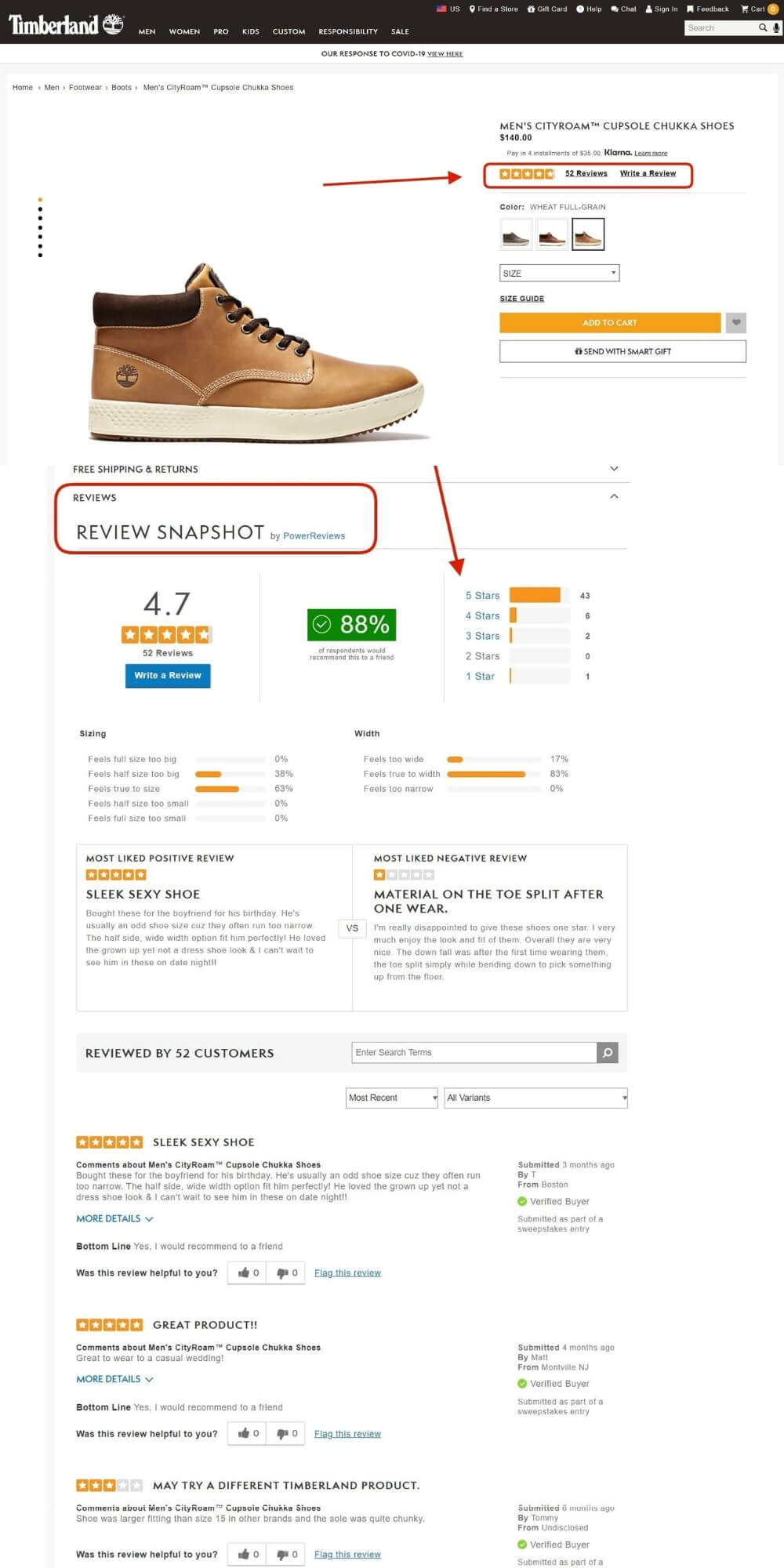
Just take a look at such a review block on the official Timberland website. The rating that the item was given by shoppers is shown right at the top, plus, there’s an extensive feedback section that occupies about half of the page. We can see a “Review Snapshot” that summarizes all the opinions in a convenient manner and even compares the most liked positive and negative reviews.
Mistake 7: Overlooking Personalization Elements
It’s no secret to any marketer that all communication with the client should be personal. Just as every message should approach a single recipient using “you”, the entire shopping experience should be crafted for every user.
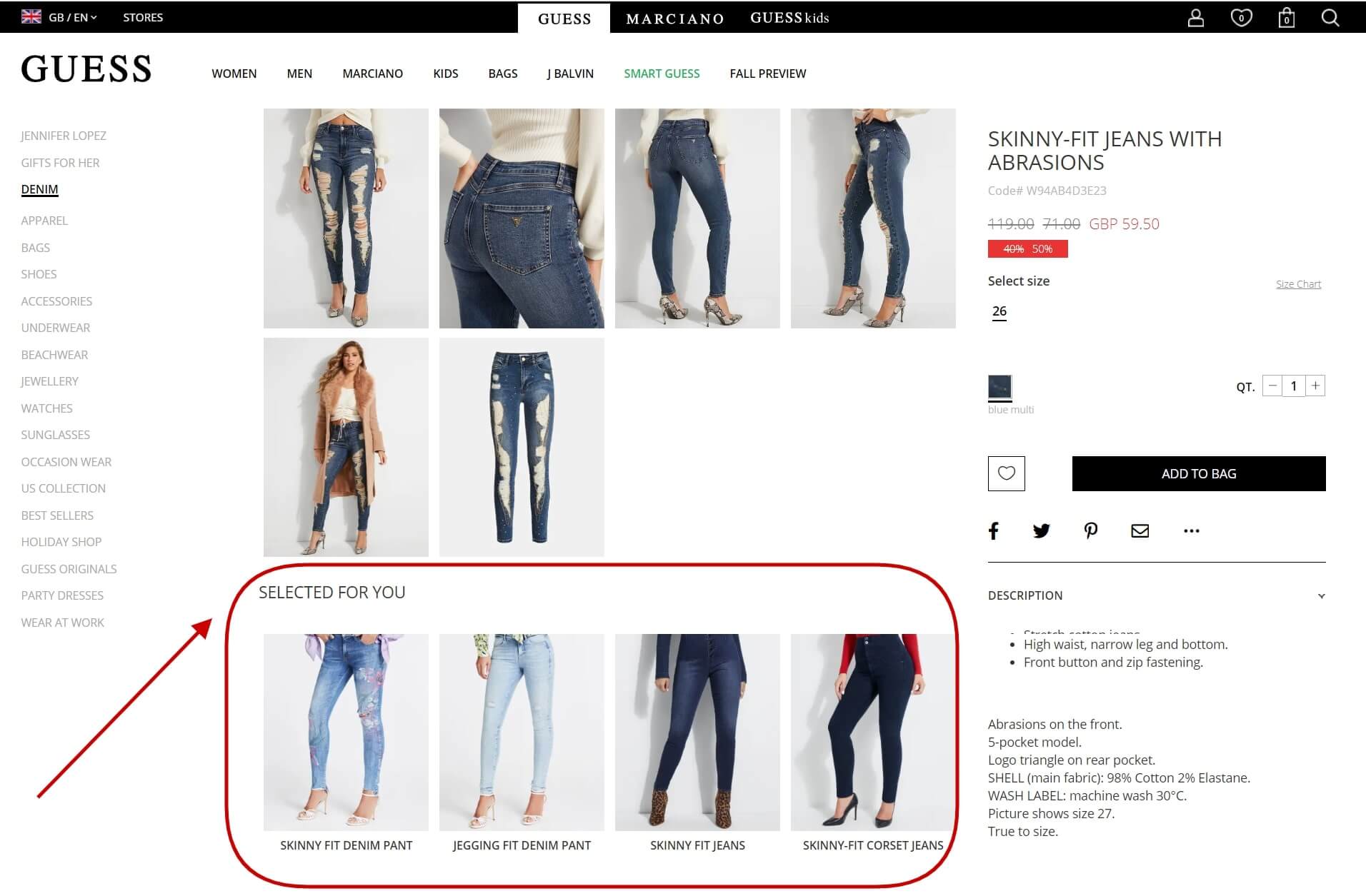
The least that can be done here to strengthen your upselling and cross-selling strategy is adding functionality that allows you to automatically pitch products that the user may find to their taste. As such, based on the person’s search and browsing history, earlier purchases, and similar buying behavior of other customers, you can offer a selection of items that the person can like. And you can do so without the need of using a virtual shopping assistant that many people find irritating. This is how such a “Selected for you” block looks like on the official Guess website.
Final Words
To sum up everything above, it takes creativity and a lot of effort to promote eCommerce websites, keep up their compatibility, and expand their online presence. We hope that you’ve found the tips for marketers given in this article handy and will make use of the best practices to grow sales of your online store!
About the Author
Alex Husar
Alex Husar, CTO at Onilab. He graduated from the Czech Technical University and obtained a bachelor’s degree in Computer Software Engineering. Alex’s expertise includes both full-stack dev skills and a strong ability to provide project-critical guidance to the whole team.


")